
To shine a light on the publication day of Little Glow by Katie Sahota and Harry Woodgate, I have a dazzling guest post from the incredible illustrator of the book, Harry. They will talk us through the process of creating the breath taking first spread, via a series of behind-the-scenes sketches!
Hello, my name’s Harry Woodgate and I’m an author and illustrator, and I’m thrilled to be contributing a guest post here at Picture Book Perfect about mine and Katie Sahota’s new picture book, Little Glow, which is published today by Owlet Press!
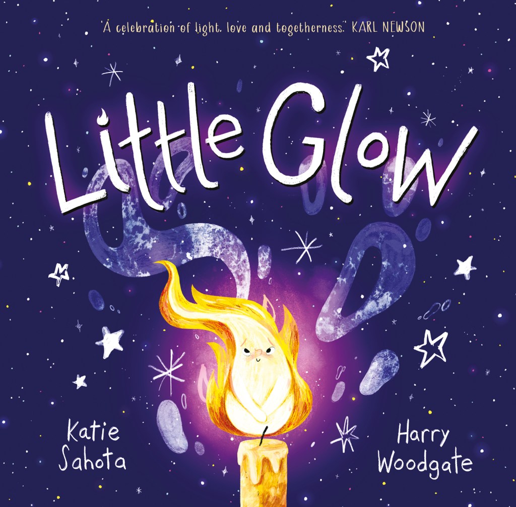

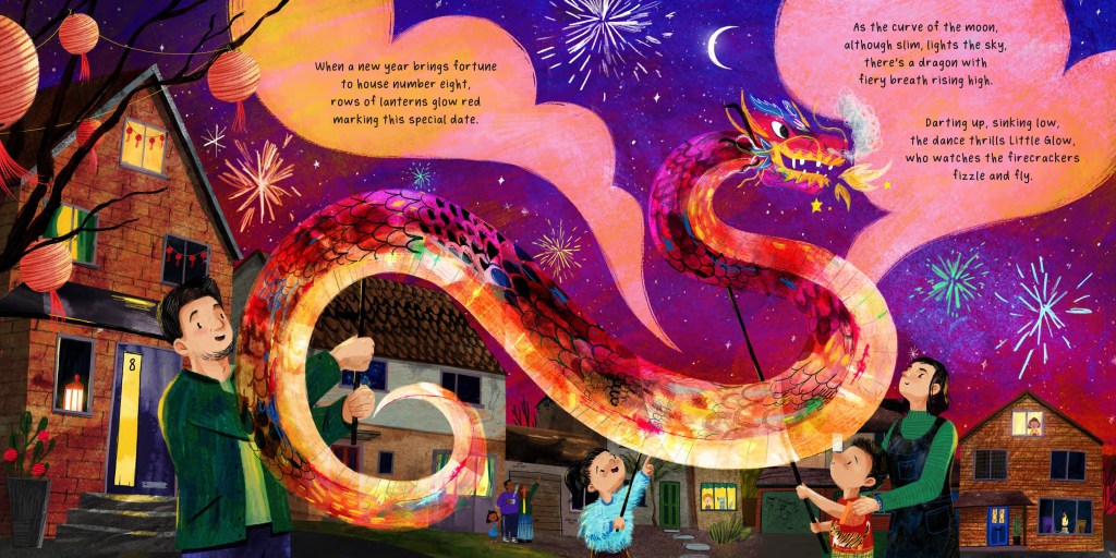
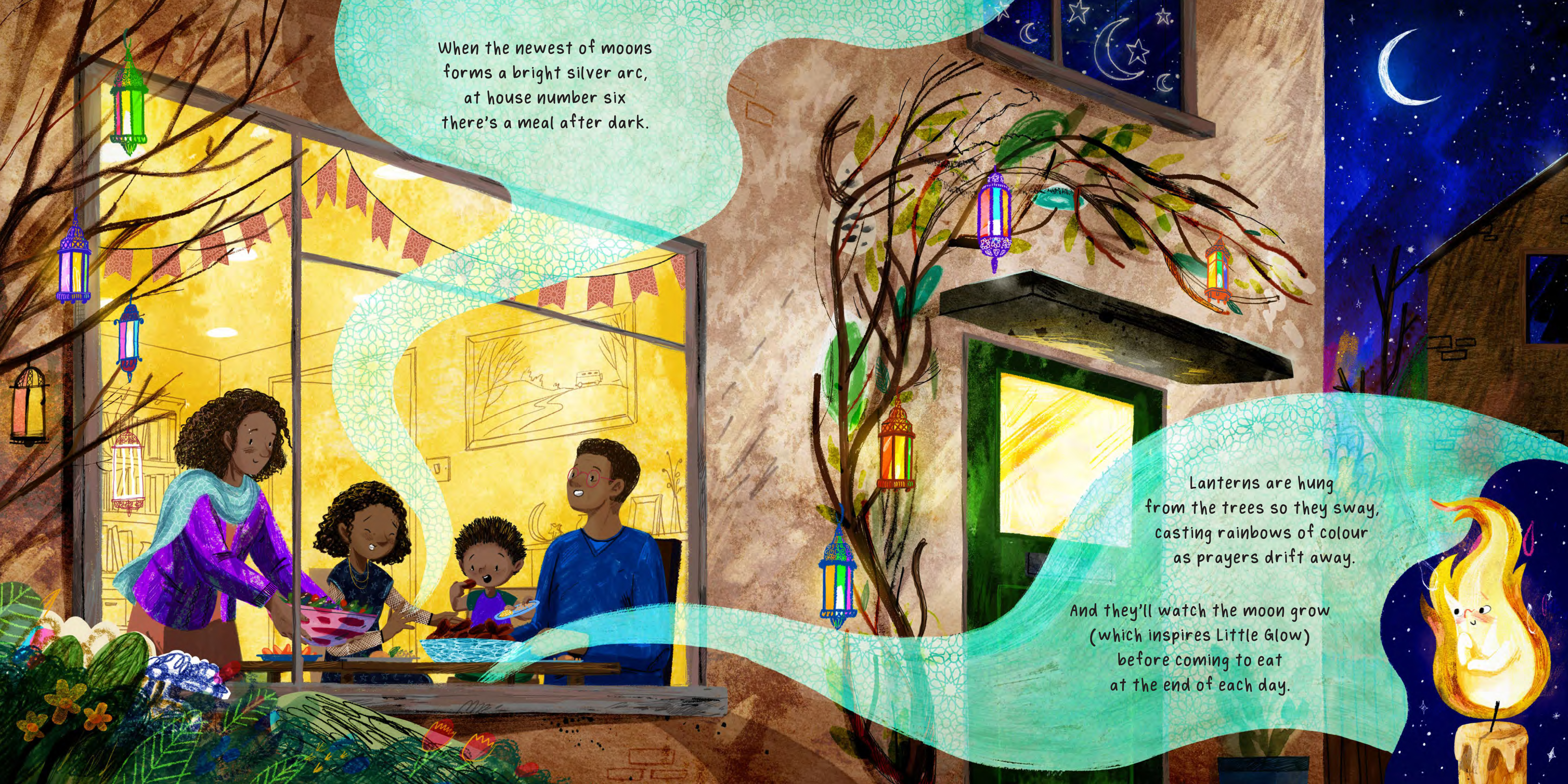
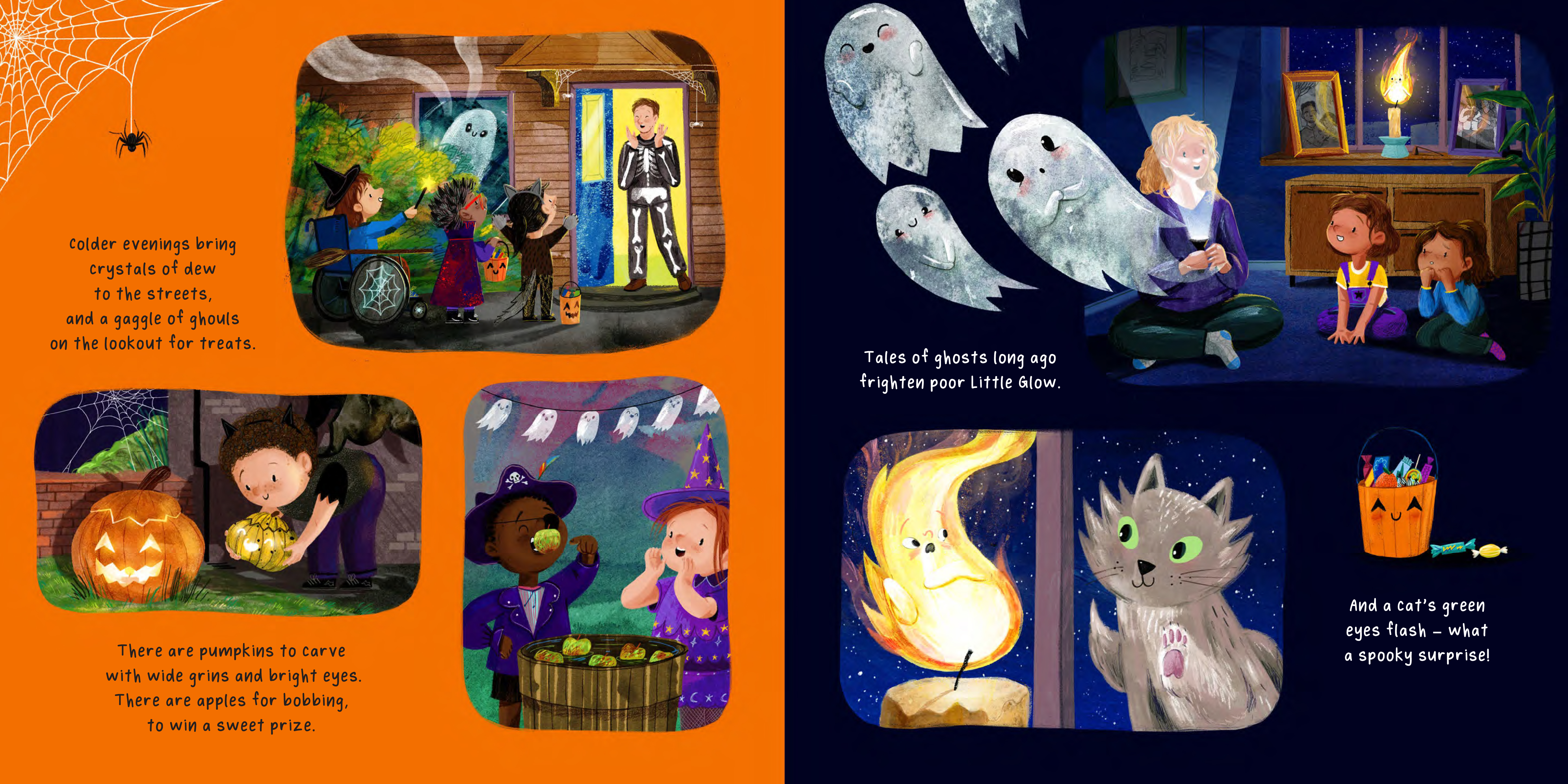
‘Little Glow’ is a story all about a diverse, multicultural community, and the different festivals of light it celebrates throughout the year. It’s also about the importance of introverts, told through the eyes of a shy candle flame who watches all the celebrations and eventually discovers its own important purpose. It’s very lyrical, very cosy, and I’m very excited to share with you a little bit of the process of how the book came together.
One of my favourite illustrations is actually the very first of the book, in which we see a panoramic view of the seaside town where the characters live. This isn’t just because I enjoy drawing buildings and landscapes (although I certainly do!) but because this spread underpins the whole story, introducing us to the community and setting the scene for the rest of the book.
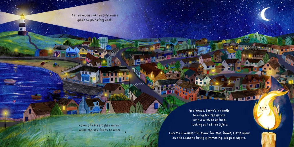
One of the many things that I find lovely about Katie’s writing is how much story exists between the words as well as within them. Not only is it wonderful to read, but it’s also exciting as an illustrator because it allows you to add something new rather than simply repeating what’s already in the text. I began by creating a map of the community, which served as a reference point throughout the project, helping me to work out all the most interesting perspectives for the illustrations, as well as which characters’ houses would be visible from different viewpoints.


Doing this also helped communicate the key message of community and togetherness throughout the story. By having all twelve houses facing each other around a central green – rather than, for instance, being spread out along a linear street – this immediately created a setting that was cosy, contained, and inclusive. Visually, each house is of equal importance, no one is stuck out at one end, and that meant characters could begin to wander from illustration to illustration, observing or partaking in each other’s celebrations and festivities.

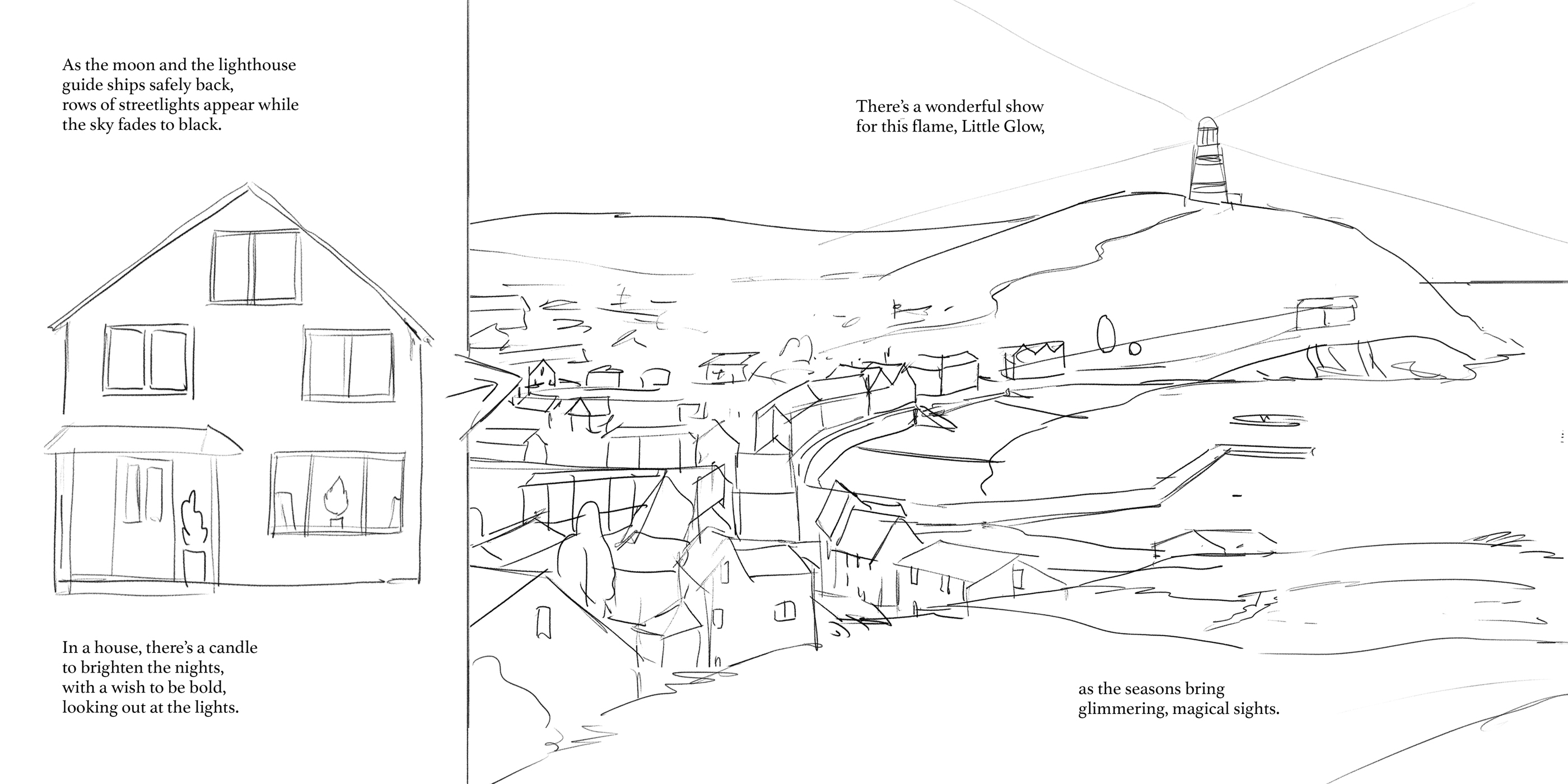
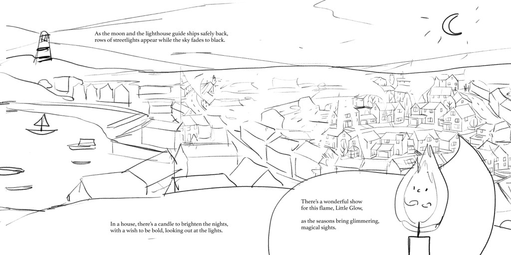
Next, I sketched out a variety of compositions for that first spread. As you can see, each one is from a different viewpoint around the seaside town – up by the lighthouse, or on the hill opposite.


We eventually settled on a final version for a few reasons:
- Having the harbour on the left-hand side and the town on the right creates a natural visual journey across the page – we are zooming into the town, towards the little cul-de-sac, rather than out of, or away from.
- This layout follows the order of the text, increasing legibility: the lighthouse is situated in the relevant portion of the page according to the text, as is the character, Little Glow.
- Viewing the scene from this angle allows us to see Little Glow’s house from the front, rather than from behind or side on, which just makes visual sense! It also meant we could add in the wisp and enlarged portrait of Little Glow, which better introduce the main character.
The next stage after pencil drafts was adding colour. I know some illustrators block out colours as a separate stage, but I prefer to just go straight in and work on a final artwork. My illustrations are a combination of traditional collage and digital painting, and I have a big folder of painted, scribbled and patterned textures which I like to re-use over and over again. For specific books, I’ll sometimes create new assets to scan in – for example, with Little Glow, I drew some firework and brick patterns, and painted some smoky ink clouds.
Once I’d scanned these textures into my computer, I layered them up in Photoshop and painted other elements digitally, such as character’s faces and other details like windows, blades of grass, road markings and shop fronts.
This illustration is comprised of approximately twelve hundred individual layers (yes, it’s obscene, and yes, my computer hates me for it).
With the main scene complete, all that was left to do was to decide the colour of the wisp in the foreground, where the text sits. We settled on a dark blue, which matches the colour of the sky and helps it blend into the rest of the illustration, maintaining that cosy night-time vibe.
I hope you’ve enjoyed this sneak peek into the process of making the illustrations for Little Glow – it was such a wonderful project to be a part of, a real team effort and I’m very thankful for Sam at Owlet Press for getting me involved! Katie’s story is beautiful and it’s a really cosy, timely, reassuring read for the coming winter months. If you fancy grabbing yourself a copy, you can do so here: www.owletpress.com Finally, a huge thanks to Catherine Ward for organising this guest post and of course Rachael for hosting it!
Thank you so much, Harry, for a fascinating guest post!
Little Glow is out today! Published by Owlet Press

I am very grateful to the publisher for providing me with a complimentary copy of this book. This voluntary feature contains my honest opinion.

Leave a comment